
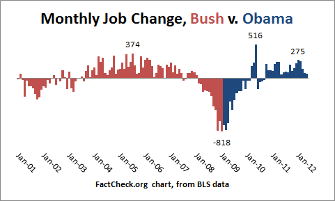
Is there a chart out there that shows monthly jobs reports from 2000 - 2012?
I’m curious if such a chart exists. Before the economy collapsed in 2008, I want to see what the monthly jobs figures were.
Observing members:
0 Composing members:
0
Composing members:
0
11 Answers

Here is information from the US Department of Labor. It isn’t in chart form, but it will give you what you are looking for if you are willing to do the work.
This chart shows September 1999 – August 2002.
This chart shows you September 2002 through August 2005.
This charts shows September 2004 through August 2007.
This chart shows September 2007 through September 2009.
This chart shows August 2009 through August 2011.
This chart shows August 2010 throughout August 2012.

Pfft.
I gotta come in here and save all ya’lls asses.
This chart goes all the way back to the first non farm payroll they took in March of 1939, and is current through the most recent October jobs report.

@tedd Great link. Thanks.
Answer this question 
This question is in the General Section. Responses must be helpful and on-topic.


